Working With Grid Layouts
Anytime you are designing for a job with multiple textual and visual elements, it is critical to follow a grid layout. Before anything else, consider what makes a good design exactly that. The way visual elements are organized, placed next to one another, and balanced is essential in how your viewer processes the information. In other words, there is no such thing as good graphic design without grid layouts.
Here are a couple of tips for grid layouts that our designers keep in mind when designing any form of visual media.
Parts of a Grid
Firstly, it’s important to understand the terms behind a grid layout.
To start, a format is the whole working area the design sits on. Next, flowlines are horizontal lines that guide the viewer across the content. They aren’t necessarily visible but are implied by the other elements working together. Flowlines are usually used to impose starting and stopping points for all text and images on the page. If text or an image flows into an area it shouldn’t, the whole design will look “off.” In turn, your viewer is likely to lose interest in what’s going on now that their flow has been disrupted.
With those in mind, here are some visual examples to highlight the main grid layout terms exactly as they are.
Margins are the negative spaces between the edges of the format and the content being designed.
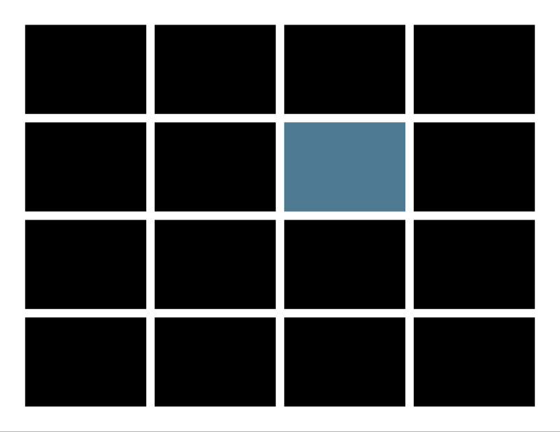
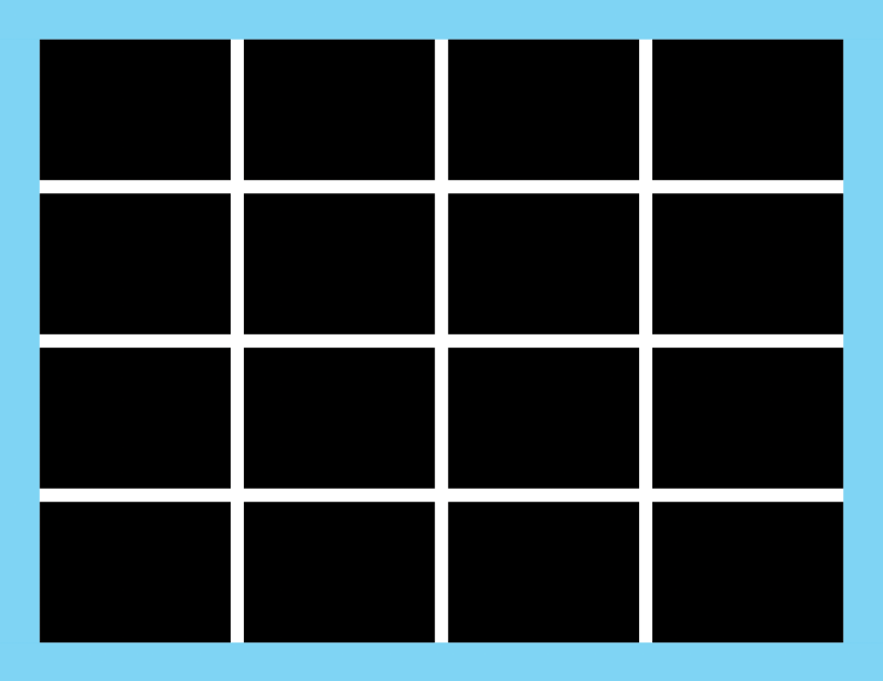
Modules are the building blocks of any grid. They are the spaces created between the flowlines and vertical lines. Vertical groups of modules together create columns. Horizontal groups create rows.
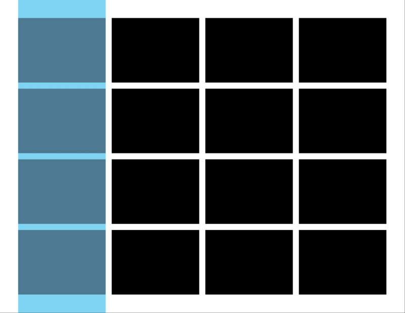
Columns are vertical spatial zones or regions that fit from the top to the bottom margin.
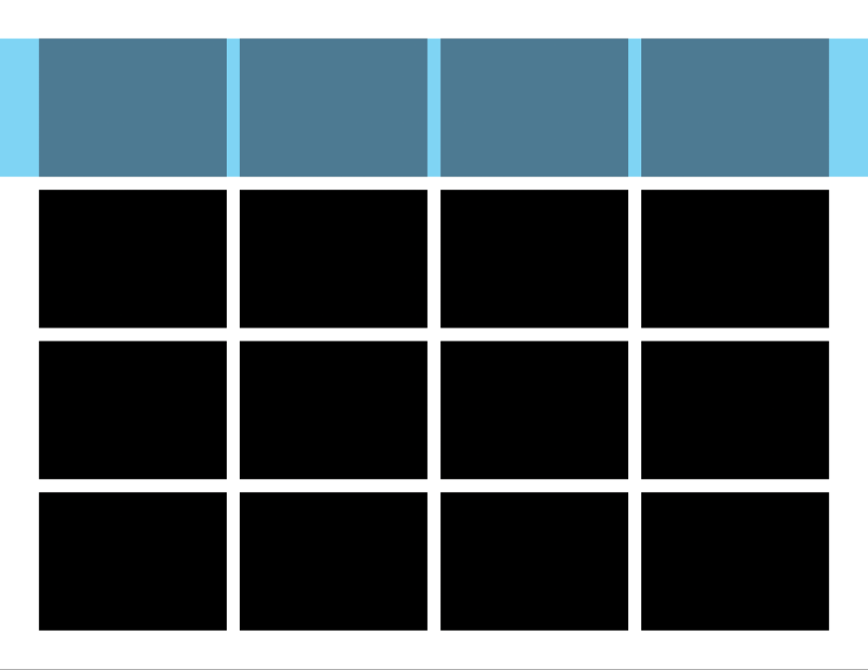
Rows are horizontal spatial zones that fit from the left to right margin.
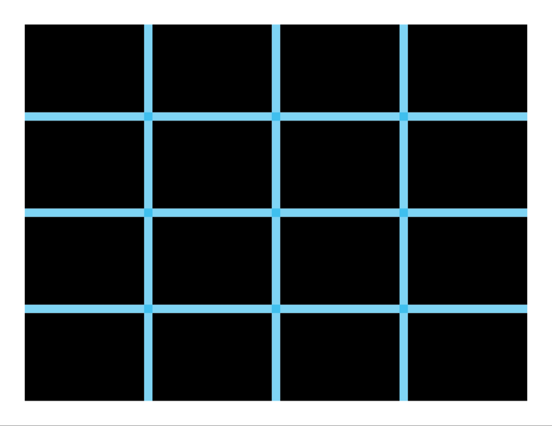
The spaces between rows and columns are called gutters. These should always be equal between columns or rows, in order to maintain a visual balance.
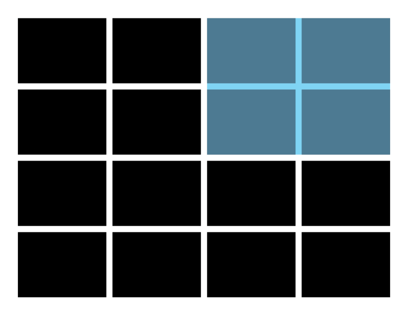
Groups of adjacent modules in vertical and horizontal areas create spatial zones. Modules grouped together are assigned a specific role for displaying information and have a distinct function.
Types of Grids
While there are all kinds of grid layouts that we could go over, these two are the most common (and also easiest to explain).
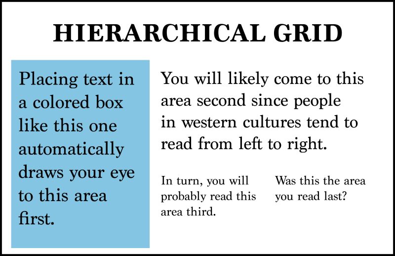
Hierarchical grids are used mainly with web design and are also very common with newspapers and other similar print layouts. Designers will use hierarchy to make sure the most important information is seen first. This may be with a call to action or a headline but can also be with more inconspicuous elements like a bolder typeset. The overall purpose is to bring attention to eye-catching elements without the viewer knowing that it has been done on purpose.
Composition grids are a bit more complex. When designers use grids, they do not always stick to the cut-and-dry formula seen above. Working with multiple grids mixed together at once is a good way to make a layout more creative and appealing to the eye. Of course, working with a grid like this takes practice and experience to fully pull off. Below is an example of what we are talking about.
The Rule of Thirds
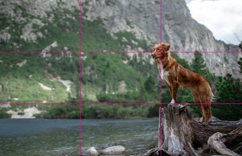
Admittedly, one of the first things designers and photographers alike learn in school is the rule of thirds, which is a composition grid that divides the format space into nine equal spaces. Where the two horizontal lines and two vertical lines intersect is where key design information should be placed. This can also work with placing the subjects on the lines themselves. Of course, the rule of thirds is a guideline, not an actual requirement, but it allows for some extra creative thinking.
The rule of thirds is believed by many to offer the most appealing kind of layout for any viewer due to its emphasis on balance and proportion.