Typeface Choices
The typeface (or several) you choose to use in your design is far more crucial than you may realize. There are those you see all the time, and then there are others that make a bigger statement. Each serves its own purpose, but they can either come together well or look disastrous if not balanced out. Here are just a couple of tips on choosing the most appropriate typefaces and fonts for your projects.
What to consider when choosing a typeface
What kinds of projects will you use the font for? Who is the audience you are marketing to, and what message do you want to send? How readable and legible does the font need to be from a distance or up close? All of these questions are reasonable to ask or simply consider.
Think first about where you will utilize the typefaces. Will they will be a one-time thing or part of an overall brand identity? For instance, if putting together a slideshow where only 20 people will view it, you likely don’t need to worry much about which fonts you’re using. However, if you’re building a branding guide where people may view your assets millions of times? You should probably put a lot more thought into it.
In addition, depending on what the project is and what message you want to send out, your typeface choices can play a critical role. Using a formal, serif font for a children’s magazine is a poor choice for that medium, but having it for a news archive would work. Understand who it is that you are targeting and use your fonts to help illustrate that message– literally and figuratively.
The fonts you choose should also be easy to read and legible between each character. For example, don’t use all capital letters with a script font; it is nearly impossible to read and also messy.
Lastly, be careful of using fonts considered “too common” in the design realm unless they serve a specific purpose or cater well to your audience. For example, the design industry commonly pans Comic Sans. However, people cite the font as being great for dyslexic readers. Again, always keep who your target audience is in the back of your mind when thinking about your branding.
Styles
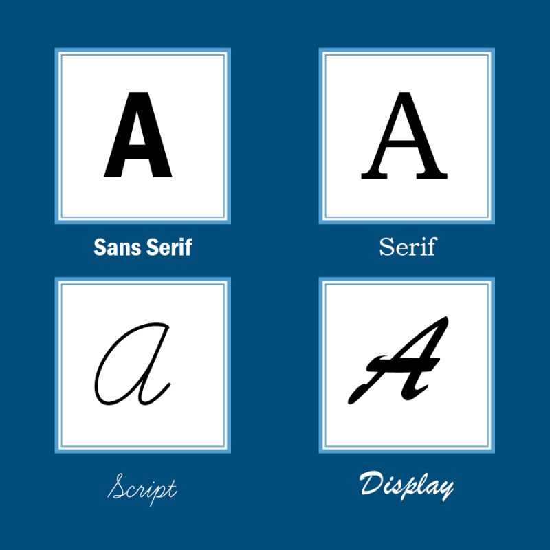
Next, we’ll go over the several styles of typefaces you can choose from for your project. The four most distinct are as follows: serif, sans serif, script, and display. Depending on where these fonts are located in your project (body text, a headline, as a caption), this may determine what kind is best.
We often view serif fonts as a more “traditional” or “formal” font while sans serif fonts tend to be more modern. Script fonts are as they sound, looking more like handwriting or cursive, and display fonts tend to not fit well in any category since they vary widely in appearance.
Keep in mind that fonts can also appear different depending on their weight and size. For instance, display and script fonts tend to be more legible at a larger size while sans serif and serif fonts (which are often more plain) work best in body text or as captions.

How fonts work together
A typeface that is joined with another must complement each other and not take away from one another’s meaning. On top of that, using too many fonts can be confusing and disjointing. We rarely recommend using more than two or three in one project; if there are, it can be distracting to read through, lose consistency, and even potentially negatively impact the brand.
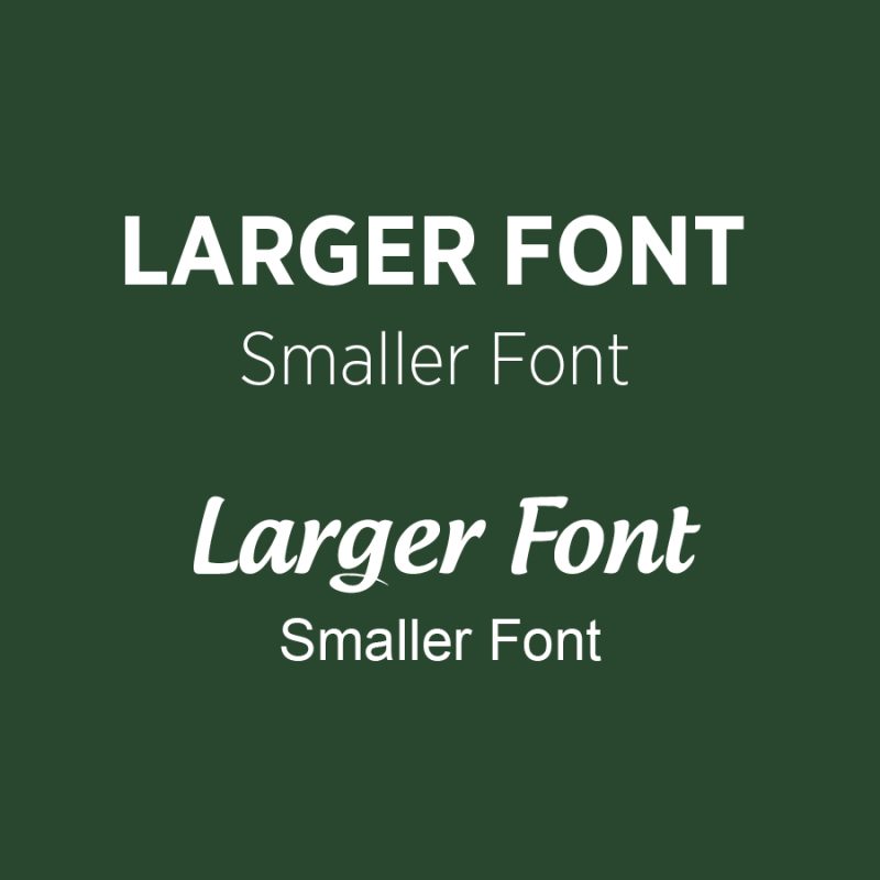
So, how do you know what you should use? If your main font is bold, choose a lighter weight font to complement it. If your main font is a script font, choose a sans serif to be alongside it. The phrase “opposites attract” truly comes into play here.

Use for print and web
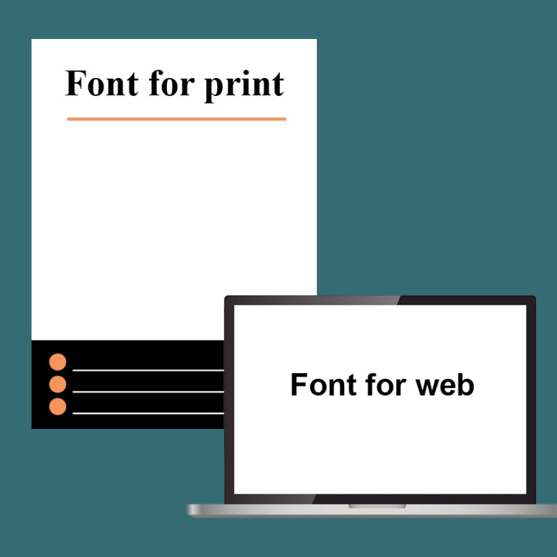
Be sure you can use your typefaces on a universal scale. Will they look right in both a printed and web format?
Like we discussed earlier, think about the means in which a typeface will be used. If it is only being used on a minimum scale, it is easy to figure out whether print or screen functionality is most important. However, if being used for multiple projects or simply on a grander scale, your marketing team will need to consider how the font will look in every medium. Fonts that look great on the web may not translate well to print, and vice versa.
In print materials, it is often a good idea to use serif fonts since they help guide a reader through sentences in a body paragraph. For the web, using a sans serif font is a better idea since the letters aren’t able to blend together. A computer screen’s resolution is lower than a printed page, so keeping your fonts as simple as possible for that medium is the best idea.
Finally, be sure to check on licensing. Some fonts will only allow for use in one medium. Others may be fine with being used in a portfolio but not in a product being sold on a product. Designers should make sure they receive full transparency on the licensing of any fonts they are using and what limitations may be in place.


